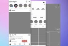
A secret plan to make application development smooth? Difference between mockup and prototype

In order to proceed smoothly with the development of smartphone apps, it is necessary to firmly establish an in-house consensus at the time of screen design. I want to avoid the situation where the design and operation are remade even though the development is almost finished.
So I want to make mockups and prototypes so that I can check them in advance. With mockups and prototypes, you can imagine screens and movements, and it is easy to identify corrections. However, many people may be unfamiliar with website design because there are few cases of mockups and prototypes. Therefore, we have summarized the features and differences of mockups and prototypes.
However, if the application development has not been officially decided, there are cases where mockups and prototypes cannot be prepared. Let’s also check the solution in such a case.
Flow of smartphone application design
First of all, let’s introduce some typical things that you should prepare for designing a smartphone app.
1. Rough sketch
Once the application plan is organized and the requirements are identified, a rough screen transition and screen image are created. At this point, a handwritten rough sketch is OK.
2. Wire frame
A wire frame is a basic blueprint for a screen. There are no design elements, and the outline of where to display the buttons and display area is summarized.
3. Mockup
A mockup is originally a model that is close to the real thing. Recently, mobile phone sales that are placed as sample products are often called “mockups.” A mockup in app development also refers to a screen design that looks almost like an app. However, since the program is not installed, it does not work even if you actually touch or swipe.
4. Prototype
The prototype is, so to speak, a prototype, with some movement added to the mockup. Prototypes are indispensable for checking usability and operability. However, since it is under development, it is common that there are restrictions on movement and that it does not cooperate with other services.
Why are mockups and prototypes needed for app development?
Mockups and prototypes are needed to reach internal consensus at each stage. You can check the screen design and layout with a mockup, and you can check the actual movement with a prototype. If you make an in-house presentation with an app that is completed suddenly without using these tools, a major correction will be made and the development schedule will shift significantly.
On the other hand, even if you make an in-house presentation with a wire frame at the design stage, it is difficult for the viewer to imagine because you do not understand the design and operability. What kind of app will it be? It can be said that the main purpose of setting up mockups and prototypes is to make it easier to imagine the completed form and identify points for improvement.
How to prepare mockups and prototypes in app development?
There is no problem if you have an outside contractor prepare mockups and prototypes, but it is often the case in app development that the supplier has not been decided or the budget has not been decided. However, it will be difficult for an app person who has no design or programming experience to suddenly make a mockup or prototype.
There is also a way to use a service that allows you to create mockups and prototypes on the Web. Recently “in apps development MockUPhone and mock-up creation tools, such as”, ” Prott has also appeared prototyping tools such as the”. It has the advantage of not requiring design or coding, but it also has issues such as “it takes time to learn how to use the tools”, “there is a free version but the functions are limited”, and “there are few tools that support Japanese”. There are many.
Therefore, there is also a method of using a cloud-type application development tool. Many development tools have the ability to create mockups and prototypes, allowing you to seamlessly prepare mockups and prototypes as you progress. Also, for example, the app development tool “Yappli” has preview apps for iOS and Android. The screen display and movement of the app often change depending on the OS, but if you have a preview app, you can check the screen and operation on the actual device.


